
For many companies expanding into global markets, “translation” and “localization” are often treated as interchangeable terms. The assumption is straightforward: translate your product content and marketing materials into the target language, and you’re ready to reach new users and consumers. But the reality tells a different story. In real-world user experience, feeling at home with a product matters far more than simply understanding its words. The details that truly define global user experience are often the ones that require no translation at all. Let’s explore why.
The Expansive Scope of Localization
Strictly speaking, translation is only one facet of localization—not the whole picture. Translation addresses the problem of language conversion: accurately rendering meaning from one language into another so that users can understand it. Localization, on the other hand, tackles the challenge of user experience adaptation. Its goal is to align a product, service, or piece of content with the linguistic conventions, cultural context, and usage scenarios of the target market—so that users feel they are engaging with a product purpose-built for them, rather than a foreign import awkwardly repackaged.
Localization addresses a far richer and more granular set of user experience questions: unit and measurement conversions, date and time formatting, name structures, address and phone number formats, currency and payment systems, third-party integrations for social sharing, and much more. Below, we examine several classic localization practices that have a direct and often underestimated impact on user experience.
Color: Another Language in Its Own Right
Color does more than shape a user’s perception of brand identity and visual comfort—it also plays a critical role in conveying information. Yet different regions, shaped by divergent cultural backgrounds and living habits, often assign entirely different meanings to the same colors. No brand can afford to overlook this factor during product design.
Consider financial trading platforms. In China, red signifies a price increase and green indicates a decline; as a result, domestic trading apps overwhelmingly use red as their foundation color. In Western markets, the logic is reversed: green signals growth while red marks a drop, so trading software in these regions leans heavily on green as the primary hue, often supplemented by blue and black to convey trust and professionalism. For institutions with a highly international user base, the safest strategy is to avoid embedding either red or green directly into the brand logo itself—and to offer users a customizable option for choosing their preferred up/down color scheme within the app.
The color palettes of popular investment and trading apps in Western markets clearly reflect the distinct preferences of their target audiences. (Source: Business of Apps)
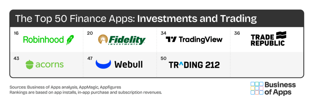
In product design, color has long transcended its role as a purely visual element—it is now an information carrier loaded with business semantics. When color itself participates in meaning-making, it becomes an inseparable part of your product content.
Icons & Layout: Where Culture Meets Convention
Icons and interface layouts may seem unrelated to text conversion—and at first glance, they appear to bypass the cost and risk typically associated with translation. But in practice, they too are objects that demand localization.
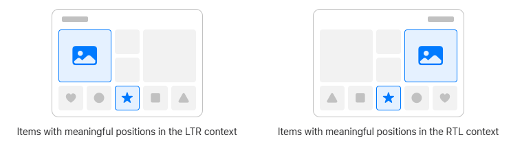
In recent years, the unique right-to-left (RTL) writing direction of languages such as Arabic, Hebrew, and Persian has drawn growing attention from companies going global. Unfortunately, solutions often stop at adapting text display to flow right-to-left, neglecting an equally important dimension of RTL user experience: the localization of icons and layout.
RTL adaptation is not merely about right-aligning text and switching its direction. It requires a mirroring adjustment of the entire interface layout to match the user’s reading habits—flipping text boxes, buttons, images, controls, and every other element whose placement is tied to the natural reading flow. The entire visual hierarchy must be symmetrically reorganized around the RTL reading axis.
Elements in a conventional LTR interface that encode reading and interaction logic must be mirrored to accommodate RTL languages. (Source: Apple Developer Design Guidelines)
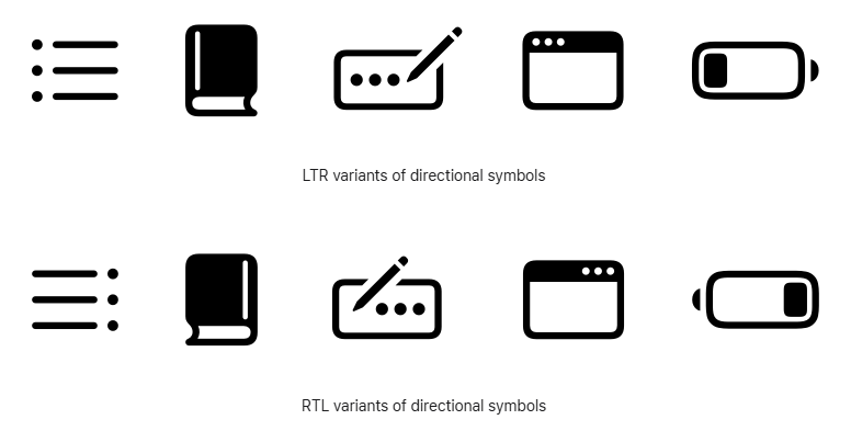
Beyond layout, many icons that embed directional reading logic must also be converted according to RTL rules. The positioning of list items, the opening direction of a book, the sequence of writing strokes, and even the orientation of a battery icon—all of these require adaptation before they truly align with the habits of RTL-language users.
Common icons in LTR interfaces that map left-to-right reading and interaction logic also need RTL adaptation. (Source: Apple Developer Design Guidelines)
Beyond RTL adaptation, icon design should wherever possible rely on universally recognizable abstract graphics and avoid any concepts tied to specific religions, political ideologies, ethnic identities, or gestures that carry cultural connotations and risk provoking misunderstanding or offense.
Looking Ahead
As more and more companies set their sights on global markets, the scope of localization continues to expand. What began as simple multilingual translation has evolved into a discipline spanning product design, user experience, and cultural adaptation. Localization is no longer a linguistic task—it is a core pillar of any serious global strategy.
Truly great localization does not show every user an identical product. Instead, it ensures that people in different cultural and living environments all enjoy an experience that feels equally natural, familiar, and trustworthy. When companies shift their mindset from “translating content” to “designing experiences,” localization steps out of the back office and onto center stage—becoming a vital bridge that connects products, brands, and users across the globe.