After several months of continuous research, discussion, and optimizations, Maxsun has officially announced its new logo and VI systems.
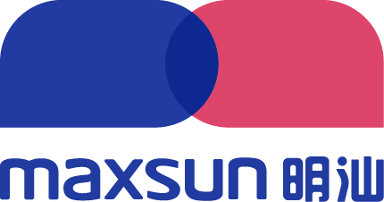
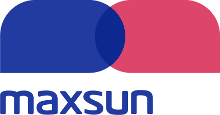
The new logo adopts the same blue and red color scheme as the old one:
- The cool sea blue symbolizes Maxsun’s logical, rigorous, and professional attitude.
- The warm rose red symbolizes Maxsun’s unremitting pursuit of service and delivery quality.
Inspired by Maxsun’s lowercase “m”, the form of the new logo abstractly outlines the essence of language services through two superimposed dialogue boxes: communication and exchange. The cool and warm colors blend together, reflecting Maxsun’s dedication to maintaining a professional and practical attitude toward its customers while ensuring quality. The new logo adopts a completely flat style full of visual flair and imagination. Maxsun’s core philosophy forged through over 10 years in the language services industry is perfectly reflected through the bold and minimalistic design.

The launch of a new logo marks the beginning of a new phase for Maxsun. In addition to continuing to provide customers with higher-quality professional services, we hope that this beautiful and dynamic visual identity can better represent our business philosophy and understanding of language services to the world.
Moving forward, Maxsun shall initiate a comprehensive internal visual identity optimization and switching process. The official Maxsun website and all media channels will gradually shift to using the new logo and make necessary adjustments and updates to all relevant visual elements. The new visual identity will also be adopted for future electronic and hard copy releases.
Get in touch
Request a quote or connect with our team to learn more about Maxsun’s language services.

